
 Kieron Gillen: one heck of a sneeze")
Hit |
Links:
|
Five stories, one title. Each story in this collection revolves around a different meaning of the word "hit". A hit and run, a shell hit, a chart hit, a hitman and a hit news exclusive. It is a nice stylistic touch and style is something that Hit tries to be both strong in yet ends up being its Achilles heel.
Writer Kieron Gillen ties the book (that's him on the front cover - style or ego? you decide) together providing the scripts while each story has a different artist. One thing that all five have in common though seems to be an inability to get to grips with the Xerox format. While all are talented they all seem to think that they are working in a glossier format than a black and white booklet. Lettering is often badly scanned and too small, the panels are frequently too crowded and the colouring lacks the necessary contrast for black and white work.
Words-wise things are better, Gillen is a freelance journalist and therefore should know his stuff. The only general mistake he seems to make is in over-writing a strip. Presumably this is because the script is written ahead of the artwork and the visualisation is pretty weak. One particular example I disliked was where the artist has provided a very strong panel of the hit and run victim hitting the street only for captions to take up a third of the space while adding nothing to the story. For the most part this seems to be the problem of someone who is used to using words and is not yet relaxed enough to allow the art, and in particular the artist, to carry its fair share of the story.
So, those general points out of the way onto the individual stories. The 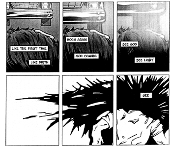 first
is about a man who is run over while fleeing from a group of muggers, the destruction
of his body and mind and the cruelty of those who witness his death. It is good
base material and a lot better than the usual lightweight crap that passes as
material in a lot of comics. I think that the story would have had a lot more
impact if it had been shortened to about three pages as there is slightly too
much going on.
first
is about a man who is run over while fleeing from a group of muggers, the destruction
of his body and mind and the cruelty of those who witness his death. It is good
base material and a lot better than the usual lightweight crap that passes as
material in a lot of comics. I think that the story would have had a lot more
impact if it had been shortened to about three pages as there is slightly too
much going on.
The second story is about survivor guilt after an artilleryman in the Second World finds himself by chance spared from the destruction of his unit. Survivor guilt is a complex phenomenon and in a short story there either has to be some particular insight offered or you have to be able to identify with the central character. Neither was true for me and I felt the story was very dry emotionally. The art fails to help as while the draughtsmanship is excellent it completely fails to mesh with the story and its characterisation ends up being very bland and generic.
Story number three is a great example of structured narrative: beginning, middle and sting in the tail ending. It works because it is a good twist and though predictable is carried out with verve. Art wise the art works with the story but appears to have been incredibly badly reproduced ending up featureless and blobby.
The fourth story is probably the pick of the litter. The artwork not only suits the format, as it relies on broader strokes and a flatter perspective-less style but also is much more inventive in the way it presents the story. Panel breakdowns are not only imaginative but repetition builds up a visual rhythm for the story. Backgrounds are often overly complex but artist Jeff Coleman seems to heed the need for striking and simple iconography in strips like these.
The worst panels for over-crowding feature policeman beating a man in front of minister while the journalist photographs the tableau from a distance. In the last of three panels the policemen are reduced to stick figures, the minister to a man with a dispatch box and the journalist is ludicrously dumped in the foreground in plain sight of all. The fault here is not with the artist who does the best he can to create some kind of image from this ludicrously complex scene. In this case it should have been clear to the writer that there was just too much going on that isn't relevant to the story. Why does the witness have to be a minister? Does Gillen really believe the rulers of this country wander the streets briefcase in hand? Why does there have to be a witness? The whole scene could have been handled simply by having policemen beat a man with a camera clicking sound effect outside the panel. Gets the job done and allows the artist to focus on providing a single attention grabbing image of police brutality. Finally of course I must point out the extremely unbelievable fact that the policemen seem to be beating a white victim, surely some mistake?
Away from the story we again have an extremely structured and formal narrative that essentially boils down to "journalist becomes news to guarantee scoop". Again probably ticks every box in on a writing course checklist but feels very detached and unengaging. The melodrama of the ending undermines any more serious point that might be being made.
The final story is based around a time-travelling assassin who accidentally kills JFK. You only have to put JFK and time travel together to realise that plot wise we're in a disaster zone. At least Gillen in his preface has the decency to admit this but feels the story is saved by artist Dale's treatment of the story. Presumably this is based on the original artwork rather than the murky, formless, badly-inked work that is actually in the comic. Again I should really reserve judgement in case the reproduction is at fault but between the art and the tiny lettering it is almost unreadable.
Hit is ambitious and I like that a lot. The art is all over the shop but that doesn't matter really as long as combinations between artist and writer that work are continued and those that don't are dropped. The stories are formal, often emotionally unengaging but again are marked by ambition. I think Hit is definitely worth reading if not because of what it is but what it aspires to be.
I imagine most of the people involved in this want to be on the next train
to the mainstream. It seems a shame because if they were willing to really work
at it and get to grips with the format they are publishing in you could have
a really killer title here.
Robert Rees
| Hit: 36 A5 pages. |
Price: ? Address: ? |
Received at ZUM! HQ: Reviewer's own Review Posted: 10vii03 |
