
O Men |
Thankfully after my initial flick through,
I was relieved to discover that this wasn't a take on Grant Morrison & Steve
Yeowell's Zenith (of 2000AD) not some gritty/surreal Vertigoesque fare. Instead
we have the mysterious Doctor O calling upon the services of a group of retired
superheroes who reluctantly agree to capture some escaped super villains for
him. So far. so typical superhero fodder. However there are lots of intriguing
questions left unanswered along with some promising character interactions, which
make Eden's claims in the introduction to issue 1 that this is a 'Super human
Soap Opera' more believable.
When Eden cuts out the unnecessary cross hatching & keeps the linework simple,
the artwork looks very effective, at times reminiscent of early (pre-Kane) Paul
Grist. At times the art may seem a bit crude & sloppy but Eden's saving
grace is his strong use of patterns from check shirts to the flow of Grace's
hair. Martin isn't afraid of using a lot of black which helps the compositions
become a lot bolder. So he may not be as slick as the Image style boys but unlike
them he knows how to tell a story. However I did spend sometime pondering over
where he cribbed some of his poses from.
Reuben Willmott.
A soap opera with superhumans as the characters is basically how Martin himself
describes the O Men. You'll note the term superhuman rather than superhero
as Martin states that his characters, "do not run about all of the time in skin-tight
costumes". The creator does his utmost in the prologue to inform the reader that
this is not your usual superheroes vs. superbaddies stuff. If this was/is
the intention why is it that by page 12 the three main characters (previously
of a now defunct superteam) are fighting it out with a group of supercriminals
for the remainder of the book? It all seems to be standard superhuman
fare with the odd bit of swearing thrown in to make it a little more street.
Perhaps the soap opera part will become more obvious in the rest of the series.
The art
is not too bad. It is clear throughout and gets too the point in most frames.
I found the character and costume design a tad boring. This may have been a conscious
decision by the creator to get away from the pants-over-the-trousers effect but
he may of gone too far in the opposite direction.
If you're into the
genre then this may be worth watching. Personally,
a comic in this genre has to be pretty special to hold my attention. This did
not. There is nothing intrinsically bad about the comic but nothing to mark it
above anything else either.
scruff
 Martin Eden: one, two - buckle my shoe")
O Men #2© Martin Eden
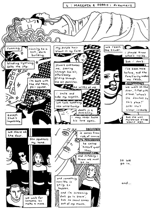
The three reunited members of a disbanded superteam are back
again. Still on their final mission to capture five dangerous escaped criminals.
The
thing that surprised me about issue 2 of the O Men was that the artwork has already
started to improve. The clarity and use of space is far better than issue 1.
This made the whole comic a far easier read. There is a far more developed use
of black.
I still believe Martin's claim of a soap opera has yet to hit the
mark. There is nothing in the story that differs from the usual darker superhero
tales. Every supertale shows some of the 'normal' life of its hero(s) and the
story in The O Men is no different.
The O Men is developing nicely. If a little more thought
gets put into the soap opera side of it then this may appeal to many people.
This one gets a thumbs up for potential.
scruff
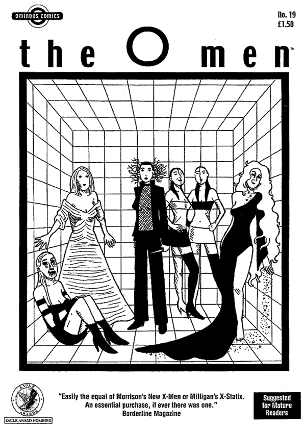
O Men #19© Martin Eden
This issue marks a pause in the story as the various factions reform and regroup in preparation for the showdown that is increasingly looking inevitable.
O-Men is perhaps not the best nor the most original comic around but it has a major plus in the fact that it is always improving. Martin Eden's art can still be shockingly static and flat, his women improbable and highly sexualised. With each issue though he improves and here it is the close ups of Molly that see the most improvement with a rounder more expressive face and a new subtlety of emotion in the eyes. The scripting is also more deft after a shaky start to issue, multiple storylines are gracefully handled and alternated. There is even an understated surprise that is beautifully handled in a just four panels.
Superheroes are not everyone's cup of tea but they are a good form for a serial. What makes O-Men stand out is the development in each issue and the almost instinctual feel Eden has for breaking a story down into parts that are individually interesting but which compel the reader onto the next part.
Robert Rees
| O Men #0 & 19: 24 A5 pages |
Price: $1 each (P+P) Address: Martin Eden, 19a Trevelyan Road, Tooting, London. SW17 9LS. |
Received at ZUM! HQ: |
